Flying Bulldogs Inc.
Email Redesign
✦ Role: Email Marketer
Timeline: Dec, 2023 – August, 2025
Tools Used: Mailchimp
The Challenge: Low Engagement and Outdated Email Design
❌Emails lacked visual appeal
❌ Good CTR but low conversions
❌ Lack of in-depth audience segementation
What I did:
I drew on my two years of experience with Mailchimp to help build and manage a new campaign. I improved layout design by updating font choices, spacing, and hierarchy to make emails easier to read and more visually appealing across devices.
Using Canva, I designed new visual assets with a focus on clean design.
I cleaned the email list to remove inactive contacts and improve deliverability. I developed an email survey to gather customer preferences, which was used to shape future content. Additionally, I built a lead generation landing page to capture new email sign ups.
What Happened:
Segemented Email List: Improved targeting led to 900+ more engaged subscribers opening and interacting with emails.
Survey Results: Survey responses were strong and revealed users’ frustrations with navigation and checkout. These insights directly informed the website redesign.
Lead Generations: Within this time frame, roughly 150 new potential customers came from the email channel.
🎯 Key Takeaway:
Listening to subscriber feedback from the survey, (which wasn’t related to the website) helped uncover a new issue and guided us in tailoring content to what customers really wanted from their shopping experience.
Flying Bulldogs Inc.
Website Redesign
✦ Role: Content Strategist
Timeline: July, 2025 – September, 2025
Tools Used: BigCommerce Content Management System
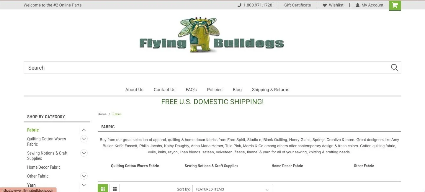
The Challenge: Correct Website Pain Points
❌ Outdated navigation and poor information architecture created user friction
❌ Lengthy checkout process leading to high cart abandonment
❌ Inconsistent typography and cluttered layouts reduced readability and overall usability
What I Did:
As the content marketer overseeing digital strategy, I led a full-site content and usability refresh. My role included improving the site’s overall layout and navigation, adding more relevant content to the homepage, and optimizing the checkout experience to reduce friction and improve conversions.
Site Audit - Key Takeaways
In order to locate areas for improvement and compare strengths with weaknesses, I evaluated the original website.
What worked ✅
Rotating image gallery showcasing company personality
Large images that clearly showcased the product
SEO optimized for finding products via Google Search
1
Layout
Utilize empty space creatively through graphic shapes, strategic content blocks, and bold visuals across the home page to guide scrollability.
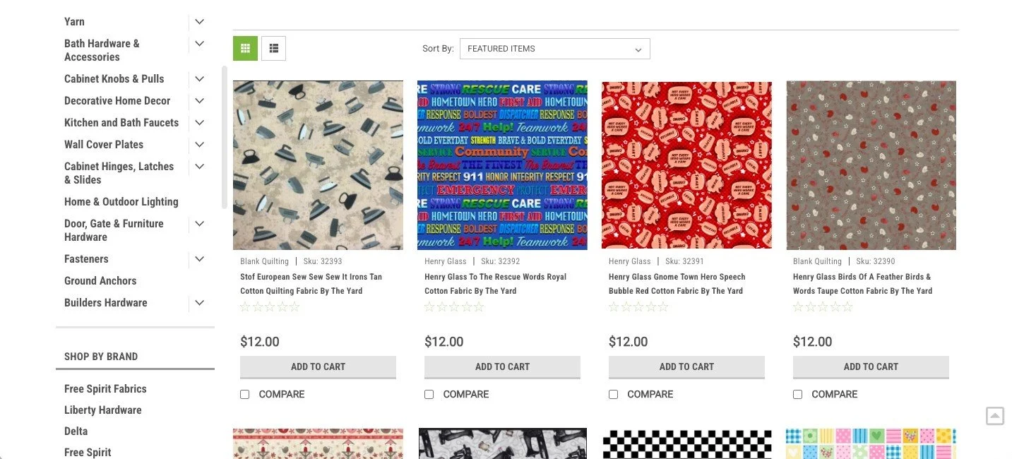
What didn’t work ❌
Tiny, generic text with little visual contrast
Unbalanced page formatting and awkward spacing
No interactive components outside the hero carousel
Poorly-structured header with counter-intuitive navigation
Redesign Goals
I identified key pain points to bring more focus and intention to my work
2
Content Hierarchy
Move page titles to central focal points and enlarge text for stronger hierarchy and readability. Replaced the waterfall dropdown with a clean, organized mega menu
Results and what’s next:
Within three months of launch, the updated site experienced:
25% increase in average session duration
40% decrease in checkout abandonment

The redesign fulfilled all initial objectives:
Created varied, eye-catching page layouts
Enhanced content clarity and page hierarchy
Introduced interactivity to increase engagement
This project was my first time making substantial changes to a website with BigCommerce and its CMS. I thoroughly enjoyed the process of balancing creativity and usability through ongoing research, feedback, and iteration.
🎯TAKEAWAYS
Things I Learned
Revamping the Flying Bulldogs website taught me the impact of thoughtful content organization and page structure on both engagement and conversions. I gained hands-on experience balancing aesthetics with functionality, and made sure that every design decision, from navigation structure to typography and layout helped to create a more intuitive shopping experience.
Next Steps
To take this project further, I’d explore advanced personalization features, such as dynamic product recommendations or tailored content blocks to further integrate the customer into the shopping journey.
3
Seamless Payment
Reduced checkout steps from 4 steps to just 2. Made sure that guest checkout was enabled, and optimized CTAs and added additional payment methods.